


Intipalka is the most important wine producer and wine brand in Peru. The microclimate of the Valle del Sol in Ica region allows it to produce incredible wines, despite not being in the traditional wine belt area.
The redesign process was based on the idea of positioning not only the wine brand in the international market but also to position the Peruvian wine category at a global level.
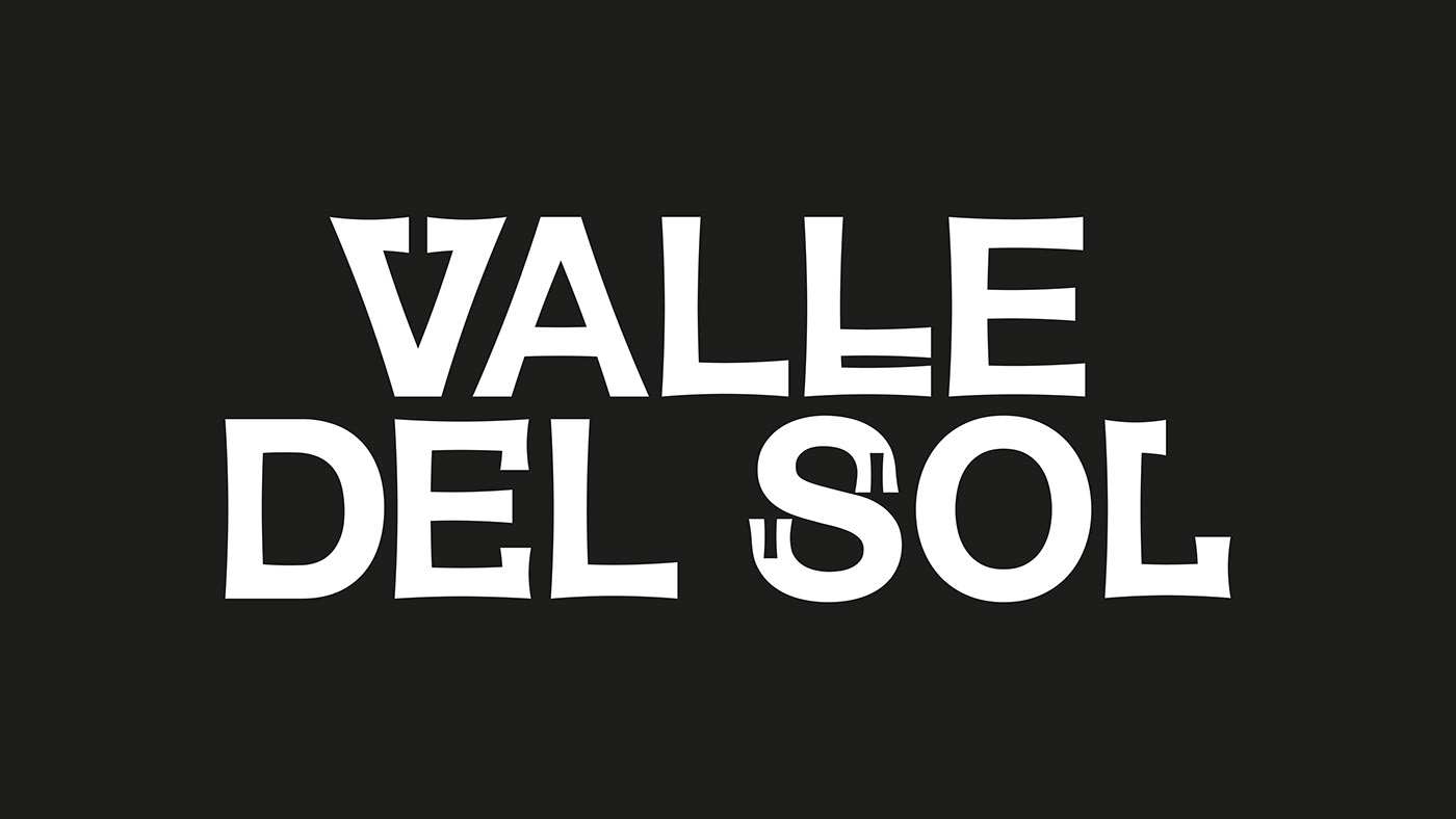
Under the concept that Peruvian wine must represent Peru, and understanding that the most honest way to share culture is through language, we developed an entire typography born in Peru, representing it in the most subtle and respectful way possible, without obviates.
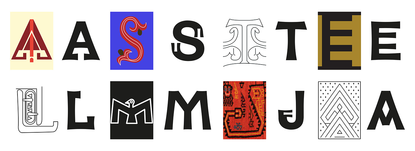
The letters came from forms found in “Introducción a la Iconografía Andina by Ruiz Durand Jesus”, a book that brings together the aesthetics of the different native Peruvian peoples throughout history.
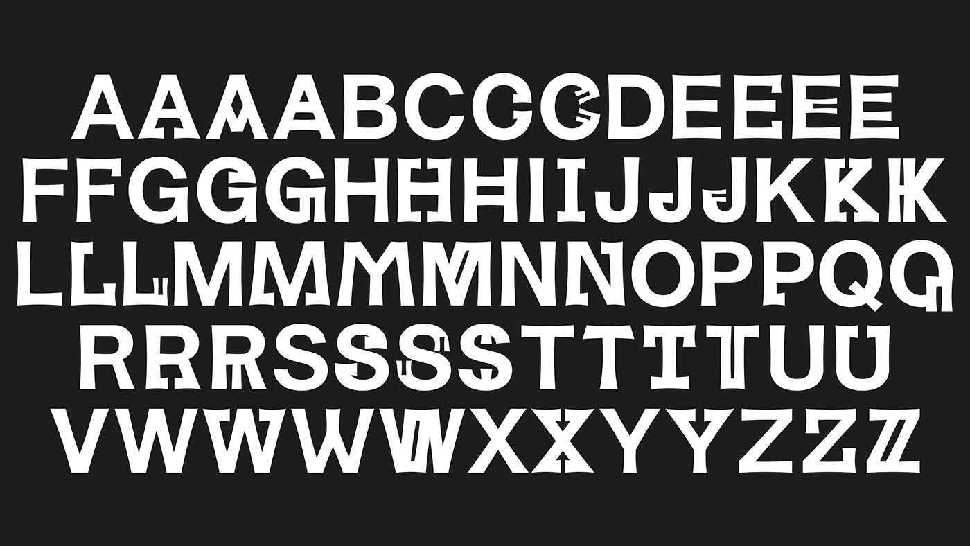
Each letter has between 3 and 5 variants that represent Peruvian culture's diversity and plurality.
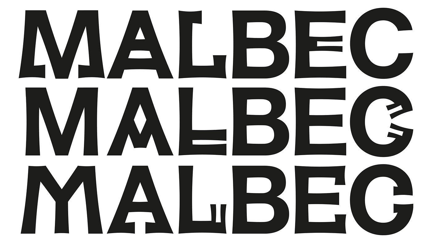
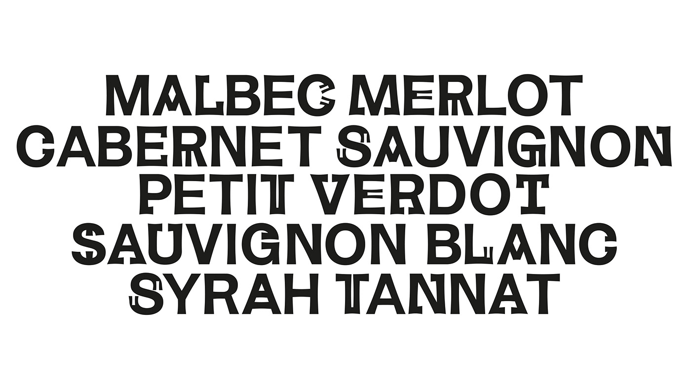
This typography is applied in labeling Intipalka’s large family of wines and in much of its communication and content.
The new brand feeling provides a greater sense of belonging to both the brand and the category, inside and outside Peru, maintaining and improving the appreciation of the quality of both.
The redesign process was based on the idea of positioning not only the wine brand in the international market but also to position the Peruvian wine category at a global level.
Under the concept that Peruvian wine must represent Peru, and understanding that the most honest way to share culture is through language, we developed an entire typography born in Peru, representing it in the most subtle and respectful way possible, without obviates.
The letters came from forms found in “Introducción a la Iconografía Andina by Ruiz Durand Jesus”, a book that brings together the aesthetics of the different native Peruvian peoples throughout history.
Each letter has between 3 and 5 variants that represent Peruvian culture's diversity and plurality.
This typography is applied in labeling Intipalka’s large family of wines and in much of its communication and content.
The new brand feeling provides a greater sense of belonging to both the brand and the category, inside and outside Peru, maintaining and improving the appreciation of the quality of both.


Revamp Project: Paz Miamor & Fibra Branding
Client: Intipalka
Design Team: Gastón García Aja, Mauricio Gallegos & Andrea Galvez
Animation: Martín Cañadell
Music: Jin Yerei
Client: Intipalka
Design Team: Gastón García Aja, Mauricio Gallegos & Andrea Galvez
Animation: Martín Cañadell
Music: Jin Yerei
Lima, Perú (2022)


